
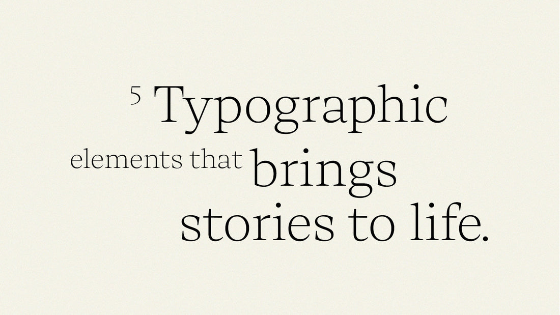
5 Typographic elements that bring stories to life
(A guide to visual storytelling through design)
Typography is more than just letters on a page — it’s a visual language that speaks before words are even read. It shapes how we experience content, influences emotion, and defines the rhythm of a story. Every curve, space, and weight carries meaning, guiding the reader through your message and setting the tone for how it feels.
From packaging design to digital content, typography has the power to evoke emotion and strengthen your brand story. Here are five essential typographic elements that can elevate your design and bring your storytelling to life.
01. Typeface and Style
Your choice of typeface defines your design’s personality.
A serif typeface conveys tradition and trust; a sans-serif feels modern and confident. A delicate script whispers intimacy, while a bold display font commands attention. The typeface you choose becomes the voice of your story — make sure it speaks the right language.
02. Size and Scale
Typography is rhythm. Size creates hierarchy, movement, and emotion.
Large type draws the reader in and creates impact; smaller type slows the pace and invites quiet reflection. Balancing scale gives your design a visual flow, helping guide the eye to what matters most.
03. Weight and Contrast
Think of typographic weight as the heartbeat of your design.
Bold, light, or italic weights bring energy and emphasis, shaping how your words are felt. Strong contrasts can create tension or excitement, while softer transitions evoke calm and balance. Weight is what makes typography come alive.
04. Spacing and Alignment
Typography breathes through space.
Letter spacing, line height, and alignment determine the readability and emotional flow of your text. Tight spacing can feel urgent or intense, while generous spacing adds openness and calm. Alignment — left, centered, or justified — shapes how the eye moves across the page and influences your design’s harmony.
05. Color and Texture
Typography isn’t confined to black and white.
Color brings emotion, hierarchy, and atmosphere to your design. A warm hue might feel inviting; a cool tone, sophisticated. Texture adds another layer of depth — from metallic foils and embossed details to digital grain — transforming words into a sensory experience.